Tuesday, 20 November 2007
Clone tool discovered in Lightroom
There is a tiny dust particle on my CCD. Well, you may all know this, but after having used Lightroom for some time, I have discovered that there is a Clone/Heal tool which allows removing signs from dust on the CCD or the lense. This is just to let you know. Good news.
As is
I decided some time ago that I would rescan my negatives already scanned with the Epson Perfection 3170 Photo scanner because I realized that batch scan in the Epson 3170 simply cuts off the edges of all pictures. I was thinking of my great art that inhabits the entire picture space and how it was brutally distorted by this machine and I made the decision to rescan everything.
Besides, I have recently bought an Epson Perfection V700 Photo scanner because I had the impression that my earlier Epson Perfection 3170 Photo scanner started to perform badly.
(It was pixelating photo scans, see my earlier blogpost about that.)
Now that I have been using Epson V700 for a while, I have really come to rescan some photos. I have given up the thing about the edges (in Epson V700 the plastic holder is such that it even covers the edges so finally why bother...). Rescanning these pictures was really the acte gratuit, the meaningless action, so probably I wanted to find some meaning, and this meaning I found in sharing.
Here we go, lo, a comparison of the very same slide scanned with both scanners.
Each scan is provided AS IS in 3200 dpi resolution over at my Picasa account, just click on the thumbnails and enjoy the view. But also beware, as they are above 60MB each.
These are 100 ISO Fuji slides taken with a Canon Eos 300 and scanned with 3200 dpi:
Epson 3170, 24-bit colour

Epson V700, 48-bit colour

Epson 3170, 24-bit colour

Epson V700, 48-bit colour

Any difference? Images of V700 are more vivid. The Epson 3170 is said to have something like a white veil on all pictures.
Post to del.icio.us
Besides, I have recently bought an Epson Perfection V700 Photo scanner because I had the impression that my earlier Epson Perfection 3170 Photo scanner started to perform badly.
(It was pixelating photo scans, see my earlier blogpost about that.)
Now that I have been using Epson V700 for a while, I have really come to rescan some photos. I have given up the thing about the edges (in Epson V700 the plastic holder is such that it even covers the edges so finally why bother...). Rescanning these pictures was really the acte gratuit, the meaningless action, so probably I wanted to find some meaning, and this meaning I found in sharing.
Here we go, lo, a comparison of the very same slide scanned with both scanners.
Each scan is provided AS IS in 3200 dpi resolution over at my Picasa account, just click on the thumbnails and enjoy the view. But also beware, as they are above 60MB each.
These are 100 ISO Fuji slides taken with a Canon Eos 300 and scanned with 3200 dpi:
Epson 3170, 24-bit colour
Epson V700, 48-bit colour
Epson 3170, 24-bit colour
Epson V700, 48-bit colour
Any difference? Images of V700 are more vivid. The Epson 3170 is said to have something like a white veil on all pictures.
Post to del.icio.us
Saturday, 17 November 2007
Keleti yellow light revisited
This was the original photo taken in yellow light:

I manipulated it by decreasing the Saturation of Orange and adding some extra saturation for the Blue. (I also added some extra Contrast and Brightness)

Then B. came up and tampered with White Balance.
Interestingly enough, he picked a spot which was white (to our eyes at least) - it was a brightly reflected, burned spot on the back of the dustman in the yellow overcoat in the middle of the photo).
This made the photo even less orangy than after my manipulation. What is more, the blues also came back.
Then we started experimenting with the different colours. Extra saturation for the yellow would make the panels underground as well as the yellow trains regain original colours. This was also an effect pleasant to the eye.
We then took back from the Luminance on the blue spot of the train's neon sign. This drastically effected the Luminance of Blues (-67). This was useful for making the shining blue surfaces, lit by neon lights, come back to reality, and become less bright (less overexposed) and more contrasted (which also means sharper).
Finally, the saturation of this spot was pushed up a tiny little bit.
Here is the result:

Post to del.icio.us
I manipulated it by decreasing the Saturation of Orange and adding some extra saturation for the Blue. (I also added some extra Contrast and Brightness)
Then B. came up and tampered with White Balance.
Interestingly enough, he picked a spot which was white (to our eyes at least) - it was a brightly reflected, burned spot on the back of the dustman in the yellow overcoat in the middle of the photo).
This made the photo even less orangy than after my manipulation. What is more, the blues also came back.
Then we started experimenting with the different colours. Extra saturation for the yellow would make the panels underground as well as the yellow trains regain original colours. This was also an effect pleasant to the eye.
We then took back from the Luminance on the blue spot of the train's neon sign. This drastically effected the Luminance of Blues (-67). This was useful for making the shining blue surfaces, lit by neon lights, come back to reality, and become less bright (less overexposed) and more contrasted (which also means sharper).
Finally, the saturation of this spot was pushed up a tiny little bit.
Here is the result:
Post to del.icio.us
All the photo communities of the web
It seems to me that I am trying them all:
Picasa
http://picasaweb.google.hu/perfectyello - Where I normally upload photos related to this blog.
http://picasaweb.google.hu/perfectyello.xxl - Where I upload oversized pictures (for testing objectives) that I would like to share with the photo community.
Panoramio
http://www.panoramio.com/user/554888
IndaPhoto
http://indafoto.hu/perfectyello
Flickr
I have several accounts on Flickr.
And last but not least, the Dreamstime Stock Photography site:
http://www.dreamstime.com/perfectyello_info
Monday, 12 November 2007
Yellow light from light bulbs at Keleti
It turns out that yellow light is actually orange. Saturation of orange was decreased to around minus 80 on these photos taken at Keleti train station in the evening.
Some extra saturation was added for the red...


...for the blue:
...for the green:


These pictures are almost black and white... or sepia.
Actually, it is hard to tell whether this is more natural. After all, light was awfully orange-yellow at Keleti.


And finally, imagine there was more light in Keleti at this night, let the white stones shine white...

Post to del.icio.us
Some extra saturation was added for the red...
...for the blue:
...for the green:
These pictures are almost black and white... or sepia.
Actually, it is hard to tell whether this is more natural. After all, light was awfully orange-yellow at Keleti.
And finally, imagine there was more light in Keleti at this night, let the white stones shine white...
Post to del.icio.us
Thursday, 8 November 2007
Is it or is it not a problem?
Is it or is it not a problem when somebody enters your photo at the bottom right corner? I definitely cannot decide. It might as well be interpreted as dynamism.

Un-sharp is clever
Normally, I like sharpness in my pictures. The Carl Zeiss Jena Flectagon 20mm f4 I was testing with my M42 adapter on the Pentax K10D turned out to be particularly unsharp - to an extent unimaginable.
Closer pictures are however sharper.
That is how the idea of this double world with the blurred underworld of humans and the sharpness of abstract signs above it occurred to me. Also, this seems to be a picture that works much better in black and white.

I have seen something very similar by Zoltán Vancsó, where things you would normally not compose in one picture fit quite well together. Like in this picture, for example
It may well be that technical perfection is a subjective term, a good picture always depends on what you make of your tools. (How clever, uhh.)
Closer pictures are however sharper.
That is how the idea of this double world with the blurred underworld of humans and the sharpness of abstract signs above it occurred to me. Also, this seems to be a picture that works much better in black and white.
I have seen something very similar by Zoltán Vancsó, where things you would normally not compose in one picture fit quite well together. Like in this picture, for example
It may well be that technical perfection is a subjective term, a good picture always depends on what you make of your tools. (How clever, uhh.)
400 ISO becomes black and white film grain
I made this photo with the 20mm Flektagon which is not particularly sharp (see my other post about this). I turned this photo grayscale, underexposed it some, and put some extra light (Fill Light), and finally pushed up contrast. The result is a lot of film grain.
 |
| Also look at other BW photos I created this way: Black and White |


Underexpose the sky
I tampered with the exposure in Lightroom, underexposed this picture about 0,8 as compared to "natural", and also put some contrast because the lens I used (the Carl Zeiss Jena Flectagon 20mm f4) is extremely soft and contrast is said to come in handy when a picture is soft.
The reason for putting the picture here is because the sky became pixelated to the eye in the smaller versions: there are amorphous blocks of dark blue.

The reason for putting the picture here is because the sky became pixelated to the eye in the smaller versions: there are amorphous blocks of dark blue.
Sunday, 4 November 2007
Pentax SMC-DA 18-55 distortions at wide angle
Here is a test picture made at the extreme 18mm wide angle with Pentax SMC-DA 18-55 that comes in the most basic kit for Pentax K10D and some earlier Pentax cameras.
Distortions appear at the edges. Extreme flare, an important decrease in resolution. Probably there is also vignetting but that cannot be seen on this picture.
The picture is uploaded in the original size to Picasa.

Distortions appear at the edges. Extreme flare, an important decrease in resolution. Probably there is also vignetting but that cannot be seen on this picture.
The picture is uploaded in the original size to Picasa.
Saturday, 3 November 2007
On the utter unintelligence of scanners
The following is the documentation of
I earlier used an Epson Perfection 3200 Photo scanner, and it did the same.
Surfaces of homogeneous or almost homogeneous colour are misunderstood by the scanner in big single-coloured blocks, while fine transitions of shades within them appear pixelated.
No idea why, actually, any explanations are welcome, mine is just a documentation of the thing.
Fuji 800 Color Film:


Black and White Ilford 100:

Post to del.icio.us
- a, a bug
- b, the catastrophic inbuilt intelligence
- c, heuristic un-intelligence
I earlier used an Epson Perfection 3200 Photo scanner, and it did the same.
Surfaces of homogeneous or almost homogeneous colour are misunderstood by the scanner in big single-coloured blocks, while fine transitions of shades within them appear pixelated.
No idea why, actually, any explanations are welcome, mine is just a documentation of the thing.
Fuji 800 Color Film:
Black and White Ilford 100:
Post to del.icio.us
SMC Pentax-M 50mm f1.7 meets the cat
SMC Pentax-M 50mm f1.7 is beautifully sharp in close pictures. This is a link to the original 10Megapixel photo I uploaded to Picasa:

Cat photography may be generally considered ridiculous but the tiny hairs on a cats body are a great test of sharpness.
Post to del.icio.us
Cat photography may be generally considered ridiculous but the tiny hairs on a cats body are a great test of sharpness.
Post to del.icio.us
Too much shadow
I made this photo of a dead tree in Utah, and I really like it so I would not let it go.
When I put the contrast up so that the background would be colourful and more sharp, the shadows on my dead tree all became black, without any detail.

So I had to restart my postprocessing. First did an extreme backlight correction to regain some of the shadowy parts, than applied contrast and colour manipulation for the background (blue sky+mountains and purple mountain range). Not all perfect, but shadows look better.

The full frame version of this picture may be purchased and downloaded here.
When I put the contrast up so that the background would be colourful and more sharp, the shadows on my dead tree all became black, without any detail.
So I had to restart my postprocessing. First did an extreme backlight correction to regain some of the shadowy parts, than applied contrast and colour manipulation for the background (blue sky+mountains and purple mountain range). Not all perfect, but shadows look better.
The full frame version of this picture may be purchased and downloaded here.
White balance and Kodak slide scan
This is a scan from a professional Kodak slide, which adds a tinge of violet (purple, magenta, call it what you like) to your photo.

And here is the result:

Buy and download a large version of this photo here.
Post to del.icio.us
And here is the result:
Buy and download a large version of this photo here.
Post to del.icio.us
My first attempts at white background stock photography
I noticed that stock photos about things often appear on a perfect white background. Now here is my very first attempt to have the perfect white background.
Photographied was a quince. Ugly, fluffy. Used my SMC Pentax-M 50mm f1.7 manual lens (75 on digital camera) because that is at least sharp. No cutout was needed, I could go as close as this
Put it down on the balcony ground on a sheet of white paper. Just plain office paper I use for printing.
This is what came out of the camera:

Two things may be noticed on the first photo:
1. balcony railings are visible
2. paper structure is visible on the shady place.

I first put some white balance and added saturation in Lightroom and then continued with the jpg export in Photoshop. I used the clone tool to make the shadoes on the railings disappear (are they visible on the quince? I do not see them, but there I did not attempt to remove the shadow).
The great thing I finally did was to "replace colour" in Photoshop (Image/Adjustments/Replace Color). Picked the greyish background which should be snow white and replaced it to become snow white. Only the desired shadows of the fruit remained. I like this replace color tool, I should experiment with that some more.
The result:

Now I am thinking about how to have better looking white surfaces in a photo like this because the shade could not be altered.
Besides, this blog post about how to make a white background picture without shadows is most useful.
Photographied was a quince. Ugly, fluffy. Used my SMC Pentax-M 50mm f1.7 manual lens (75 on digital camera) because that is at least sharp. No cutout was needed, I could go as close as this
Put it down on the balcony ground on a sheet of white paper. Just plain office paper I use for printing.
This is what came out of the camera:
Two things may be noticed on the first photo:
1. balcony railings are visible
2. paper structure is visible on the shady place.
I first put some white balance and added saturation in Lightroom and then continued with the jpg export in Photoshop. I used the clone tool to make the shadoes on the railings disappear (are they visible on the quince? I do not see them, but there I did not attempt to remove the shadow).
The great thing I finally did was to "replace colour" in Photoshop (Image/Adjustments/Replace Color). Picked the greyish background which should be snow white and replaced it to become snow white. Only the desired shadows of the fruit remained. I like this replace color tool, I should experiment with that some more.
The result:
Now I am thinking about how to have better looking white surfaces in a photo like this because the shade could not be altered.
Besides, this blog post about how to make a white background picture without shadows is most useful.
Under a red roof
Photo taken under a red roof creating extreme red atmosphere.

Corrected in Adobe Lightroom with the white balance correction tool.

Buy and download this photo here.
Corrected in Adobe Lightroom with the white balance correction tool.
Buy and download this photo here.
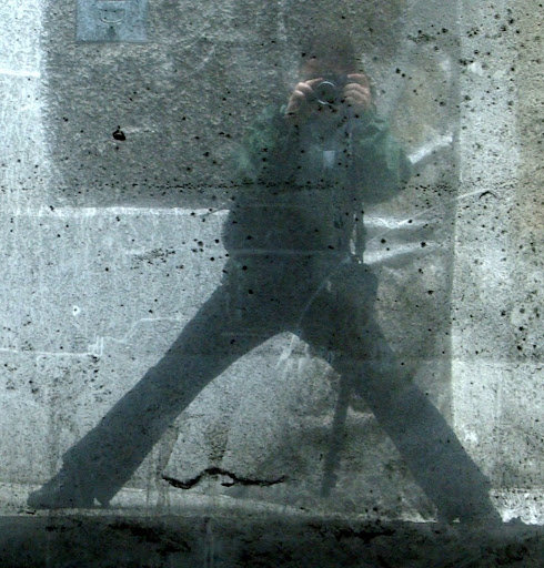
Why this photo in my profile?
As a start, I uploaded this photo to my profile:

Just wanted to mention that since I rarely take pictures of myself, it is always difficult to find a good picture of me.
This one is rather artsy, and may even be considered to represent the photographic procedure - note that I am reflected on a polished metal plate full of scratches while I am taking the picture. The definitive classic in reflexive autoportrait photography. I chose it not (only) because of that but because I cannot be seen. :-)
What is going to happen on this blog?
I have created this blog to keep track of my photography as a procedure. I am going to jot down my ideas about my photos so that I do not forget them. Doing this on the web is useful for a number of reasons: one is that I do not have to think about a format, second I will hopefull not lose my data and finally, this way some others may profit from my remarks besides me.
I call this procedural photography because here I do not want to share my art (in case I really happen to have one) just look at photography as a procedure. An intimate intellectual procedure.
Also, while I may not be able to tell in nominal terms what this is going to be, I know what I am going to do, what kinds of posts I am going to make.
Actually, this is the first time I have the feel of blogging, and I am excited that the genre seems to have come to me.
Subscribe to:
Posts (Atom)
